Have you ever wondered why you feel more calm after spending some time in an environment clear and neutral? Or where else energetic after being in a space bright and colourful? It is very likely that the answer is related to the cores and its power to influence our emotions and well-being.
In every interior design project, colours are studied in detail to convey specific sensations. Each colour and each shade is associated with a particular emotion, which impacts our state of mind. Therefore, before starting an interior design project, we should always consider how we want to feel in that/those space(s).
Does it seem complex to you? In this article, we help simplify this topic and suggest some of the most commonly used colours in interior design, so you can find inspiration and apply them in your home.
Colour psychology: what is it?
Fundamental in interior design, colour psychology is a theoretical approach that analyses and explores how colours influence human behaviour. This influence occurs because colours are stimuli physical stimuli that are perceived by sight and subsequently decoded by the brain, resulting in certain sensations. Our humour, ours creativity, our decisions and even ours mental health. Everything is driven by these stimuli. Understanding this interaction between colours and emotions helps us create environments that match yours. functionality and to ours emotional needs.

Rettan Bed | Liquid Layers Organic | Antony Bedside Table | Captain Flint floor lamp | IC T1 Table Lamp | String Light Cone Pendant Lamp
Choosing the right colour for the environment
Every space in our home has its purpose. Whether it is an office intended for concentration and productivity, a living room where we want to relax, or a bedroom for peaceful rest, colour plays a fundamental role in the atmosphere of the environment. Choosing the right colour can truly make the difference between a space harmonious It is uncomfortable and conveys intentions incorrectly.
Over time, there have been various colour trends in interior design, trends that come and go. However, their psychology and effect on us remain consistent. Therefore, it is not always advisable to make a choice based on temporary trends. There are certain colours in particular that are widely used in interior design because they convey exactly the desired feelings for specific areas of the home. Let’s get to know them:
1. Green
In colour psychology, green is considered a very colour optimistic for being associated with sensations of calm, balance e harmony. It is a colour that reminds us of the freshness from nature, being, therefore, an excellent way to add life the spaces. All shades of green create serene and balanced environments, however the lighter ones – such as sage or mint – convey a greater tranquillity and positively influence concentration. We can use green in any room of the house; however, we suggest its application in leisure and relaxation areas, such as the living room.

Myra Armchair 683 | Olden Sofa | Liquid Layers Rectangle Rug | Shitake Coffee Tables | Oblique Floor Lamp | Thierry Support Tables
2. Blue
The best way to talk about the feelings conveyed by the colour blue is to think of the waves of the sea. Fluid like them, this colour conveys to us a great sense of peace and from tranquillity. It is one of the most studied colours in colour psychology, due to its strong impact on mental well-being. It is, therefore, a colour that should be chosen for spaces where complete tranquillity is required – such as the bedroom, for example.

Barcelona Bed | NomNom Light Pendant Lamp | Pet Light Purr Table Lamp | Trichroic Shapes Rug
3. Orange
Inviting e friendly, the orange colour makes us feel fun e enthusiastic. In its most vibrant version, this colour boosts energy levels, of creativity and from joy. It is a colour that inspires communication and social interaction, making it a perfect choice for living rooms or leisure spaces. It is also an excellent option for those looking to add a touch of colour to neutral spaces, creating an environment comfortable. For any of the options, we recommend using softer or more earthy tones to avoid overstimulation.

Napoli Sofa | Trevor Pouffe | Jill Coffee Table | Obon High Side Table | Geen-a Floor Lamp | Double Boxx TV stand
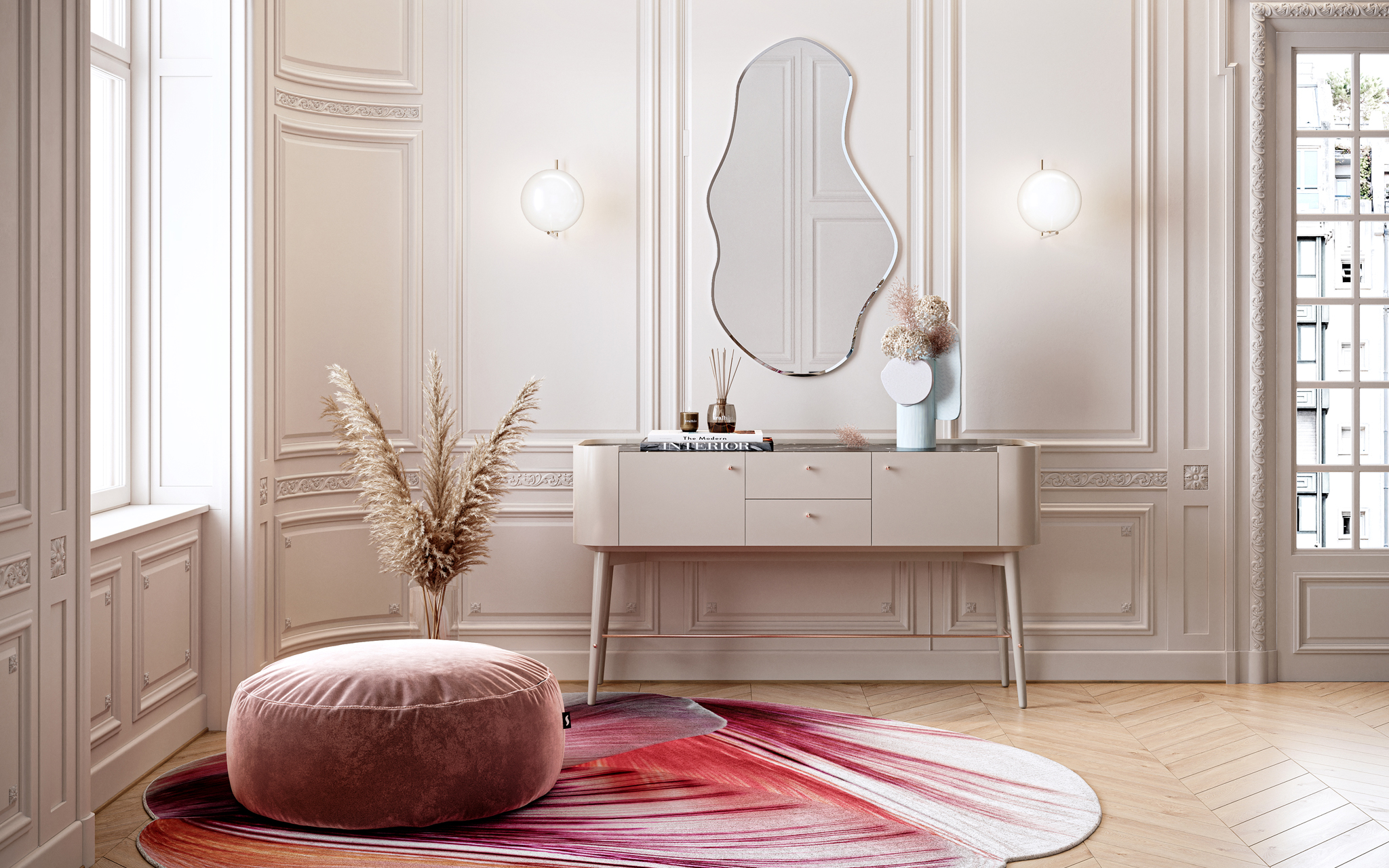
4. Pink
Underestimated by many, pink is one of the most versatile In interior design, it is one of the most powerful in colour psychology. It is a colour that influences the emotions closest to the heart, thus being associated with romanticism. Softer tones – such as pastel pink or flamingo – are perfect for to illuminate the spaces, while the brighter tones help to highlight Unique details. Coral and salmon are the most commonly used shades, as they convey the same emotions associated with the colour pink, yet they prove to be a little more neutral and, therefore, excellent for modern spaces e contemporary. From the bedroom to the entrance hall, every space in the house is perfect for adding this colour.

Ballet Console | Red Shell Rug | Trevor Pouf | Pound Large Mirror | IC W1 Wall Lamp
But how do we ensure that the shade of orange chosen for the dining room is not too stimulating, or that the blue in the bedroom is not too cold?
These are some of the questions you may have right now. Amid an infinite colour palette, choosing the right shade can be extremely challenging. In the Tralhão Design Centre find professionals who will help and guide you in this world of interior design. Our team of specialists has the experience and a sensitivity certain to understand your vision, creating environments functional, aligned with yours emotional needs. Schedule one meeting with us!
For more information, contact us by phone at 239 506 400 or by email at